Minimalist home design is an often-misunderstood design philosophy. It’s common to lump it in with modern design, and while the two do share similarities, they are distinct styles. There is also a popular misconception that minimalist design must be cold, uninviting, and unforgivingly practical. While simplicity and functionality are elements of a minimalist aesthetic, when well designed, these minimalist spaces can also be warm, calming and inviting.
Minimalist design first appeared in the mid 20th century, and in the 2020’s it is making a vibrant comeback. This may be due to the fact that with increasingly hectic lives, people yearn for simplicity in their home life. This leads to design that encourages ease and serenity. There are a few elements to minimalist design, and knowing a little about them will help us to understand this design philosophy better.
Minimalist Color Palettes
In modern minimalist home design, soft and neutral color palettes are typically used. This stands in stark contrast to the brightly colored accent walls and other colorful elements that were a mainstay of residential interior design in the 2000s. However, this doesn’t mean that the palette has to be cold.
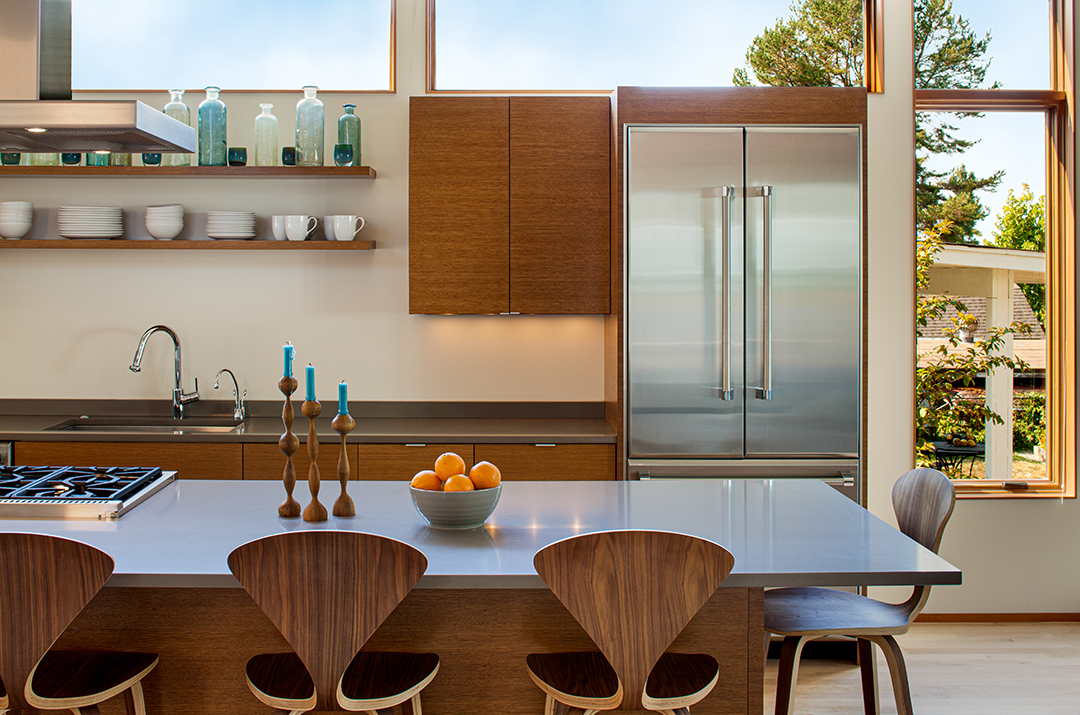
The goal of minimalist design is to ease the mental burden on our attention by simplifying sensory stimulation. A good example of a simplified color palette is our Hillside House project on Bainbridge Island. This interior uses clean white with structural gray concrete walls to create visual simplicity, and warming wood accents. The large windows bring in a lot of natural light, which further warms the white, creating a calming and inviting space.
Minimalist Lines and Shapes
To help feature the simplicity and functionality of a minimalist interior design, shapes and lines are clean, bold and simple. This includes walls, surfaces and furniture. Shapes are often strongly geometric, providing structure to a space that might otherwise lack visual interest. While minimalist homes do without flamboyant, ornate details and patterns, the elegant composition of lines and forms creates visual appeal while maintaining the calming effect of minimalism.
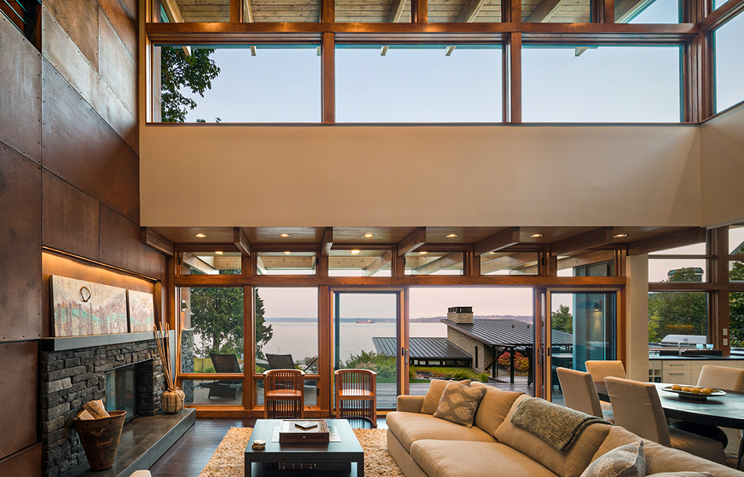
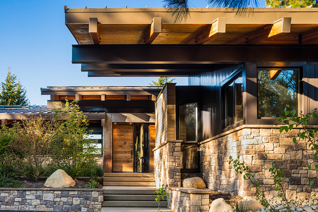
Our Sonoma Valley Estate Guest House and Green Lake Residence make use of this aesthetic. Clean, bold lines are present in repeated rectangular windows and furniture. Window treatments are elegant and seem to disappear into the top of the windows. The furniture is elevated on rectilinear legs, creating more crisp lines and angles which complement the rectangular features. The cantilevered roof creates a spacious feel and draws lines through from the interior to the exterior of the home with the wood slat finish.The high ceilings and windows also allow the interior to feel open and calming.. The angular roof line adds variety and interest, both inside and out, without creating unnecessary visual clutter.
Minimalist Textures
While minimalist homes may lack bold colors and patterns, they play with textures in a way that creates warmth and personality. This use of texture can come from both architectural features and design elements. Textured elements can be large or small, but using them sparingly helps maintain the harmonious and peaceful feel of minimalist design.
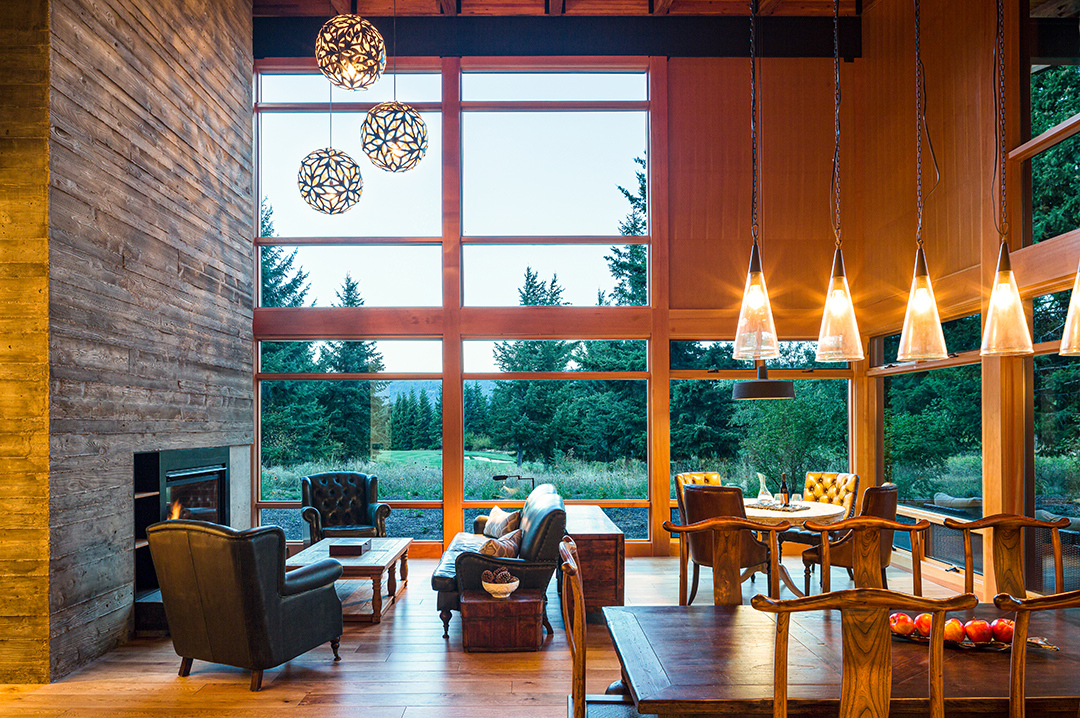
The Tumble Creek Cabin project uses a variety of textures both inside and out. Much of the textural appeal comes from structural elements which provide visual interest without feeling cluttered. This comes from the use of a variety of materials. Beautiful stonework on the exterior, expanses of wood both inside and out, and the exposed steel and wood beams supporting the ceiling all provide contrasting textures. The board-formed concrete chimney offers a subtle texture to soften this massive, grounding feature. The simple leather and wood furniture adds more character to the home without unnecessary clutter.
Minimalist House Decor
While the interior decor of minimalist home designs is spare, it can be done masterfully without disrupting lines and shapes. These decor elements support the open-plan design common to modern minimalist houses. They also retain and promote the bold lines of minimalist design, conferring structure and tranquility to the interior. While decor items may blend in with minimalist architectural elements, they may also contrast or accent them. Abstract wall art, soft textiles in neutral tones, and objects with curves and clean lines, can soften the look of minimalist architecture, creating an inviting space. Into this palette are interjected important momentos of the resident to be highlighted against the minimalist home to create an interior as unique as the people who live there.
Inside our Hansen Road House, you’ll find mostly bare walls with visual interest provided instead by the variety of materials used. Rugs in neutral colors with soft and textured piles soften and warm the rooms. Accent pieces with round shapes and curving lines contrast with the bold rectangular shapes that dominate the interior. Furniture stands on legs and pedestals, revealing beautiful floor space and promoting an airy, open feel.
While minimalist architecture and design can feel cold, hard and generic, when done by skilled architects and designers it creates a clean, graceful and refreshing environment for living. . . From major architectural elements, like open plan design and high, vaulted ceilings, to aesthetic details like materials, furnishings, and accents, a minimalist home can be uniquely yours and beautifully inviting. At Coates Design, we take pride in our work, and we’re confident that we can help you build your dream home while fulfilling our vision to benefit the environment, the economy, and the community. If you’re looking for beautiful design and high-quality construction, contact us for more information.
